
I have been, or can be if you click on a link and make a purchase, compensated via a cash payment, gift, or something else of value for writing this post. As an Amazon Associate, I earn from qualifying purchases. Please read my full Affiliate Disclosure for more information.
Ever wonder how folks make those fancy open-concept spaces look like they actually belong together, instead of just two rooms that forgot to put up a wall? To pick a cohesive color scheme, you start with a solid base palette and a core color that just chills out, even when the light gets all shifty. You’ve probably noticed that a little planning goes a long way when you’re trying to make things match.
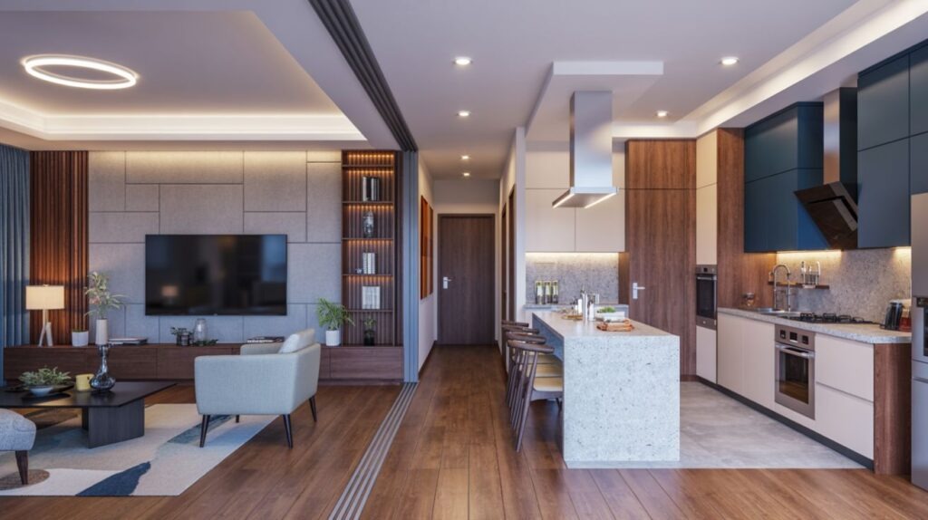
You also want to use the same kind of stuff (wood, stone, metal) in both areas. I mean, nobody wants a kitchen that looks like it’s from Mars and a living room from Venus, right? Balance the warm and cool stuff, letting those little accent pieces dance around your main color. Think of it like a good band, with a solid bass line and the other instruments jamming along.
Key Takeaways
- First things first, get yourself a core color that just hangs out in the background, keeping everything calm. This color is going to be the anchor for all your other decorative bits and pieces.
- Next, pick a main color scheme with some backup tones. This helps everything look like it belongs, especially when the sun’s doing its thing and showing off all those textures.
- You should definitely use the same kinds of wood, stone, and metal. It’s like wearing matching socks for your house, giving a nice, consistent feel between the kitchen and living room.
- Mix and match your warm and cool elements. Pair those cozy, warm colors with some crisp, cool accents. Then, mess with the lighting to set the mood, like turning down the lights for a late-night talk.
- And here’s the thing: write down what you do. Keep track of your colors, finishes, and lighting choices. This way, everything flows together smoothly, and you don’t end up with a room that looks like it got dressed in the dark.
Understanding Your Base Palette
Your base palette is like the foundation of a house. It sets the whole vibe for your kitchen and living space. You’re going to figure out how certain colors make things look, picking just a few main hues to hold the whole place together. It’s not rocket science, but it does take a bit of thought.
The good old color wheel is your friend here, showing you what colors play nice together. Think of those complementary or analogous pairs. They keep things balanced without screaming for attention, like a good referee. Pick one dominant color and some supporting tones, then see how much contrast you can get without things looking weird. This adds some depth, like a well-told story.
Now, consider the natural light you’ve got. How do the materials and furniture look when the sun hits them? Make sure your palette feels right across all the zones. Write down your choices. This keeps you honest later, and makes sure your cohesive decisions are actually cohesive, not just wishful thinking.
Balancing Warm and Cool Tactors
Balancing warm and cool elements is the secret handshake between your kitchen and living space. It’s all about how color, light, and texture play together in both areas. You’re trying to get the temperature just right, like adjusting the thermostat. Pair some warm, comfy neutrals with cool little accent pieces. This makes things deep without getting into a shouting match.
Color psychology is a thing, believe it or not. Inviting colors can give you a boost, while calmer tones make you want to kick back. It all depends on what you’re doing in the room. And don’t forget the lighting effects. Warm LED lights make your sitting area feel super cozy, while cooler light can highlight your workspace or some cool architectural bits.
Keep your finishes and textures consistent. We’re trying to avoid any jarring shifts here. Aim for a nice rhythm where each area helps the other out, but still keeps its own job. It’s like a well-oiled machine, everything working in harmony.
Selecting a Unifying Core Color
Picking a unifying core color is like choosing a solid, reliable friend. It’s gotta be a steady, adaptable background for both your kitchen and living spaces. Think about how this core color holds your whole color family together. It guides your other color choices while letting the accent pieces do their own thing, depending on what’s happening and how the light’s hitting them.
The goal is a balanced harmony. You want subtle contrasts that keep the spaces looking connected, not like they’re yelling at each other. This main color is the quiet hero of your design.
Core Color Harmony
Choosing a unifying core color is how you get your kitchen and living spaces to hold hands without making a big fuss. You’re going for harmony, not loud contrast. So, pick a main color that has a good temperament, like a chill neutral or a subdued earth tone. Those usually work best. Think about how the light changes that core color on different surfaces. A versatile shade will keep things consistent, from where you chop veggies to where you kick up your feet.
Now, throw in some subtle variation with a few monochrome accents and just a touch of texture changes. This gives it depth without being distracting. Use color blocking in moderation. It’s good for marking out different zones, but don’t let it mess with the flow. The whole point is to have a cohesive backdrop that makes your art, furniture, and textiles look good, guiding your eyes with quiet confidence.
Anchoring Tone Choices
To really nail your tone choices, you start with that unifying core color. It’s the room’s tonal backbone, giving the whole place some serious structure. This core color is going to guide all your accent pieces and contrasts, making sure everything in your kitchen and living space plays nice together. You want a color that sticks around in your furniture and overall vibe, not just in the little decorations.
Think about how the lighting might shift that same color throughout the day, making it look warm or cool. This can really change how deep things appear. A neutral color often works best here. It’s like a good blank canvas, ready to support all sorts of textures and materials. From this anchor point, you can start testing out paint swatches in your typical lighting. Then, make sure your trims, cabinets, and upholstery all line up. Following these clear, measurable steps will give you color relationships that are both cohesive and built to last.
Leveraging Shared Materials and Textures
Using shared materials and textures is how you get your kitchen and living spaces to speak the same tactile language. It’s like they’re having a conversation without saying a word. You want to prioritize material continuity by using the same surfaces (wood, stone, metal) in both areas. This keeps things smooth, cutting down on any visual disruption. Nobody wants to feel like they just walked into a different house when they go from the kitchen to the living room.
Texture layering adds depth without making everything too loud, so mix some smooth surfaces with a little bit of grain or a cool tactile finish. Choose countertops, cabinets, and upholstery that feel like they’re from the same family. Then, change up the size and finish a bit to keep things interesting. Make sure both areas get enough light and air. This keeps things from getting boring. This approach makes sense for your senses, helping with cohesive planning without making each area lose its own personality.
Repeating Cues Across Spaces
Repeating little cues across your spaces is how you make it feel like everything belongs together, like it’s all part of one big, happy family. It’s about echoing key motifs, colors, and shapes from the kitchen right into the living area. You get continuity by mirroring those shapes, lines, and scales, so things look intentional, not like a sudden stop. It’s like a good movie soundtrack, with a recurring theme that ties it all together.
Use those decorative accents to reinforce a shared vocabulary. Think vases, textiles, or even the outlines of your cabinets, reappearing with slight differences. Your lighting effects should also be on the same page. Consistent temperature and glow unite the atmospheres without taking over the show. Think rhythm over repetition here. Those small, intentional echoes keep the harmony going, guiding your eyes and how you perceive the space. When these cues line up, your rooms feel like one thoughtful, curated environment, not just a bunch of separate boxes.
Playing With Saturation and Contrast
Saturation is like the volume knob for your colors, so test how those softer hues play with brighter accents to keep everything looking connected. Use contrast wisely. Lighter tones tend to back off, while deeper shades grab attention for your focal points. You don’t want to overwhelm the kitchen or living area, so a subtle hand is best here. It’s a delicate balance, like making sure your seasoning is just right, not too much, not too little.
Start with a simple color scheme, then throw in some targeted bursts to guide the eye and define the flow. It’s like putting up a few signs to tell people where to look, without making it look like a carnival. This helps create a sense of movement and purpose in your design.
Saturation Harmony Tips
To keep things looking connected between your kitchen and living spaces, you need to be smart about your saturation. Push those bolder colors in one area, then use lighter, more muted hues nearby. This creates a visual gradient that gently guides your eye without any jarring surprises. It’s like a smooth transition, not a sudden stop. You’ll get balance by using monochrome layering. This means using different shades of the same base color. It adds depth without clashing, like a good layered cake.
Now, introduce complementary accents sparingly. These little pops of color can add some energy without making everything too chaotic. Keep those saturation shifts intentional and gradual. We’re trying to avoid sudden jumps that make the room look like a confused teenager’s wardrobe. This approach keeps things harmonious while highlighting architectural lines, textures, and furniture. The result is a cohesive, sophisticated, and purposeful space, not something that just happened by accident.
Contrast Weighting Tricks
Even more than just color, contrast weighting is how you train the eye to really see your space. You’ll dial up the saturation and contrast where you want people to pay attention, and dial it back where you want things to feel calm. In real terms, use color blocking to tell people where to look. Then, adjust the visual weight with lighter or darker shades and clear edges. It’s like putting a spotlight on the star of the show and dimming the lights on the extras.
Save those really vibrant colors for accents or a single feature wall. Keep everything else around it a bit softer to maintain balance. Contrast should support a hierarchy, not a free-for-all. Even subtle changes can guide the flow between your kitchen and living zones. This disciplined approach gives you cohesive, easy-to-read spaces without making too much noise.
Choosing Accent Schemes for Each Room
Picking your accent schemes for each room means making sure those little pops of color match the overall mood and what you actually do in the space. Don’t just chase whatever’s trendy. You’re balancing how colors make you feel with what’s practical. Those small, purposeful accents should help you get through your day. Think about how you use each room, then pick an accent that really nails that purpose without being too much.
Consider where your furniture is. That helps direct attention and keeps things flowing. Put the brighter stuff where people gather, and the calmer things where you relax. Use repeatable motifs across both spaces. This helps tie the whole house together, while still letting each room have its own personality. Keep your palettes cohesive, and don’t overcrowd them. You want those accents to feel deliberate, harmonious, and like they’ll stick around for a while.
Testing and Refining Your Color Flow
Testing and refining your color flow is all about getting your hands dirty with some practical checks. You need to evaluate how colors travel from room to room. Notice where those contrasts feel intentional and where they just feel disruptive. Adjust things before you commit to a full repaint. It’s like test driving a car before you buy it.
You’ll want to simulate daily movement. How do things look when you’re just walking through? Pay attention to how decorative pieces help with those transitions, and test how warm things feel in different spaces. Use lighting accents to highlight what you want to stand out, while still keeping everything harmonious. Track how colors shift at different times of day and with various light bulbs. Then, tweak your saturation, brightness, and undertones as needed. Document those small iterations, avoid going overboard, and aim for a subtle continuity that supports what you do, how you feel, and the story of your kitchen and living space.
Conclusion
To really nail that cohesive color flow, you start with a simple foundation and let it grow thoughtfully. Ground your spaces with a shared core hue. It’s like giving them a common language. Then, weave in warmth and contrast using carefully chosen accents and textures. Repeat those little cues across the rooms, but change up the saturation a bit to keep things interesting. Use recurring materials to unify everything, not to make it feel overwhelming.
Test your ideas thoughtfully, refine things patiently, and trust in proportional shifts over making big, bold changes. The end result? A harmonious, aesthetically intentional environment that feels connected, but still lets each space have its own unique vibe. It’s like a good recipe, where all the ingredients work together to make something delicious.
Leave a Reply