
I have been, or can be if you click on a link and make a purchase, compensated via a cash payment, gift, or something else of value for writing this post. As an Amazon Associate, I earn from qualifying purchases. Please read my full Affiliate Disclosure for more information.
Layer textures and patterns to build depth, warmth, and a clear visual rhythm in your room. Start with neutral foundations, then layer tactile surfaces—plush textiles, natural fibers, and matte-to-sheen contrasts—to anchor the space. Balance bold patterns with calm neutrals, and repeat motifs across fabrics and finishes to unify the look. Vary scale to guide the eye without overwhelming, and use pattern to emphasize focal points. If you keep exploring, you’ll discover deeper cohesion and nuance.
Key Takeaways
- Layer textures with a mix of plush, slick, and natural materials to add warmth and depth, balancing with neutral bases.
- Use bold patterns sparingly, anchoring them with calm neutrals to create visual flow and avoid clutter.
- Vary scale and motif direction to establish rhythm, repeating motifs across textures for cohesive harmony.
- Align furniture and lighting along a dominant axis to guide movement and define zones subtly.
- Choose durable, tactile materials with appropriate weight and finish, balancing performance with comfort and visual appeal.
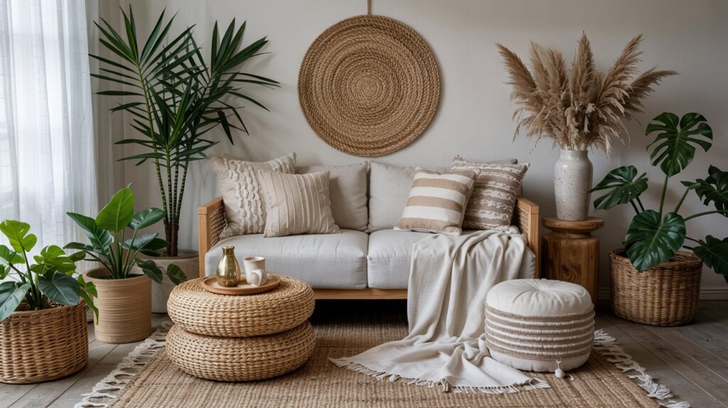
Layering Textures for Warmth and Depth
Layering textures adds warmth and visual depth by combining tactile surfaces that respond to light differently. You’ll curate a palette of materials—plush textiles, slick finishes, and natural fibers—to create layered tactility. Start with a base of broad, neutral textiles to establish tactile diversity, then introduce contrasting surfaces to emphasize textural contrast without clutter. Consider fiber weight, weave, and sheen to control reflections and shadow. Pair matte ceramics with satin metals and a woven rug to anchor the space. Maintain proportion and rhythm so texture enhances form, not overwhelms it, guiding the eye toward focal points and architectural details.
Balancing Bold Patterns With Calm Neutrals
Bold patterns energize a room when tempered by calm neutrals, creating a balanced field that reads as intentional rather than chaotic. You’ll achieve this by anchoring bold graphics with restrained tones, ensuring contrast supports legibility and rhythm. Implement neutrals in walls or large-scale textiles to provide visual rest between statement elements. Choose wall murals or geometric tiles that echo a shared scale, avoiding clashing motifs. Limit the color palette for accessories to two or three complementary neutrals, letting texture and form carry emphasis. This approach preserves cohesion while allowing bold patterns to serve, rather than overwhelm, the overall design language.
Building a Unifying Color Story
Color anchors establish the core hue family you’ll repeat across fabrics, finishes, and accents. Achieve cohesion by balancing patterns and textures around those anchors, ensuring each element reinforces rather than competes. Consider how subtle shifts in saturation and tone across items create depth while maintaining a unified color story.
Color Anchors
Color anchors serve as the backbone of a cohesive palette, guiding choices across furnishings, textiles, and finishes while allowing accents to pivot without breaking the overall harmony. You’ll leverage color psychology to set intent, then calibrate tones for mood enhancement and perceived balance. This framework prevents color drift during selections, ensuring consistency across surfaces and textures.
1) Define a base trio that reflects your space’s function and lighting.
2) Map contrasting accents to support focal areas without overpowering.
3) Test on swatches in natural light before committing.
4) Record color ratios to maintain proportional harmony throughout finishes and fabrics.
Pattern Balance
Pattern balance relies on weaving textures and motifs into a unified color story, ensuring that repeat motifs, scale, and contrast reinforce focal points without creating visual noise. You’ll align hue relationships and weight across fabrics, so fabric contrast stays intentional and serene. Consider pattern proportions: large motifs anchor the room, medium repeats support rhythm, and small details fill gaps without overpowering. Maintain a cohesive tempo by limiting the palette to three to four tones, then test alternations under lighting. Achieve harmony by balancing positives and negatives, so texture remains tactile rather than loud, delivering a deliberate, refined pattern narrative.
Texture Layering
Texture layering builds a unifying color story by manipulating tactile contrasts and surface finishes to reinforce depth and cohesion. You’ll harness textural contrast and tactile appeal to knit disparate elements into one harmonious palette, guiding eye flow and mood without overpowering detail.
- Select core textures that mirror your color story, then layer secondary textures for subtle variation.
- Vary scale and sheen to create depth, ensuring each piece complements the next.
- Test light at multiple times of day to confirm cohesive texture perception.
- Evaluate durability and care to maintain texture integrity over time.
Mixing Prints Like a Pro: Scale, Motifs, and Rhythm
You’ll establish harmony by balancing scale and rhythm, pairing large motifs with finer ones to avoid visual competition. Consider how motifs recur across textures to create a coherent flow, while varying scale to guide the eye without overstimulation. Aim for deliberate rhythm: alternate bold prints with quieter ones to keep the composition dynamic yet cohesive.
Scale and Balance
When mixing prints, scale and balance act as the governing cortex for a cohesive composition: large motifs anchor the room, medium motifs fill space with rhythm, and small motifs tie details together without competing. You’ll manage scale contrast and visual weight to prevent overload while sustaining interest.
- Prioritize dominant pieces with bold scale, then layer medium motifs for harmony
- Pair contrasting scales to emphasize focal points without clashing
- Distribute color and texture to maintain even visual weight across surfaces
- Test rhythm by alternating motif directions and orientations for steady flow
Motifs and Rhythm
As you move from scale and balance into motifs and rhythm, focus on how repeated shapes and patterns create a visual cadence that guides the eye. Motifs and rhythm establish a cohesive language across textiles, wallpapers, and furnishings, enabling deliberate visual storytelling without overwhelm. Pair scalable motifs with contrasting scales to maintain harmony, using rhythm to stagger repeats and lead attention through the room. Align motifs with color relationships to reinforce depth and texture. Consider a central motif as the anchor, then echo it through secondary patterns. Precision in repetition yields clarity, balance, and a sophisticated, purposeful environment.
Selecting Materials That Feel Inviting
Selecting materials that feel inviting hinges on tactile warmth, visual depth, and subtle performance under real use; the goal is a surface language that communicates comfort without compromising durability. You’ll balance tactile cues with performance, ensuring longevity and ease of care. Prioritize natural fibers and cozy textiles without sacrificing resonance, texture, or color stability.
- Evaluate natural fibers for climate, durability, and hand feel.
- Choose cozy textiles with appropriate weight, drape, and abrasion resistance.
- Test surface friction and warmth visually and tactilely before installation.
- Consider maintenance, stain resistance, and colorfastness under common usage.
Incorporating Texture Through Furniture and Accessories
Texture isn’t just about surface feel—it’s a structural tool for shaping atmosphere. In furniture and accessories, you cultivate texture through material variety, pattern density, and tactile contrasts. Prioritize textural contrast by pairing smooth woods with woven fabrics or velvets against metals, ensuring each piece adds dimensionality without visual clutter. When selecting items, pursue balanced scale and complementary finishes to avoid competing textures. Use accessory layering to deepen interest: stack textiles, drape throws, display sculptural objects, and intersperse textured cushions with architectural accents. This approach preserves cohesion while enhancing tactility, so the room reads intentional, refined, and inviting.
Practical Tips for Cohesive Room Flow
Achieving cohesive room flow starts with a clear axis of function and sightlines, then aligns those elements through deliberate placement, scale, and rhythm. You implement practical cohesion by coordinating lighting techniques with furniture layout, ensuring shadows and highlights guide movement. Storage solutions must integrate visually, not crowding pathways. Maintain a restrained palette to keep focus on textures and patterns, letting variation occur in scale and balance.
- Establish a dominant axis and secondary channels to direct movement.
- Align seating, tables, and clutter with sightlines to minimize visual friction.
- Use lighting techniques to delineate zones without overpowering them.
- Integrate storage solutions that hide excess while maintaining access and flow.
Refreshing Your Space Without Overdoing It
Refreshing your space without overdoing it means making selective, meaningful updates that elevate atmosphere and function without triggering visual overload. You lean into restraint, selecting key textures and patterns to reinforce function rather than distract. Emphasize monochrome minimalism to unify surfaces, then introduce accent color sparingly to preserve calm. Favor clean lines, balanced scale, and purposeful placement for cohesion. In practice, swap clutter for intentional storage, reduce competing motifs, and allow negative space to breathe. Aim for modern simplicity: a measured mix of texture, tone, and light that enhances usability while preserving clarity and serenity. Your room should feel intentional, not busy.
Conclusion
In short, you achieve cohesion by intentional texture pairing and a restrained color scaffold. Start with tactful layering—softs underlapped with structured surfaces—to build warmth without clutter. Balance bold patterns with calm neutrals, letting a unifying palette knit varied motifs into one narrative. Treat scale, rhythm, and material choice as measurable variables, not mood; check flow between furniture, textiles, and accents. Finally, refresh deliberately, replacing only what obstructs harmony, so space remains inviting, focused, and technically elegant.
Leave a Reply