I have been, or can be if you click on a link and make a purchase, compensated via a cash payment, gift, or something else of value for writing this post. As an Amazon Associate, I earn from qualifying purchases. Please read my full Affiliate Disclosure for more information.
The rug in your living room is like the foundation of a good house. It grounds everything, defining where things belong and keeping your furniture from looking like it’s floating in zero gravity. You gotta let the art do some heavy lifting too. It guides your eye, setting up focal points that play nice with your sofa’s size and the way your room flows. Pick colors that bridge different textures, you know, some neutral shades with a mix of warm and cool notes, all finished with varying levels of shine. This keeps everything cohesive without looking like a bland spreadsheet. Balance those bold patterns with some quieter textures. Then, arrange your seating so people can actually talk to each other without having to shout across the room like they’re at a loud concert, all while making sure there’s still a clear path to the fridge. If you keep digging, you’ll figure out how to dial in this balance even more.
Key Takeaways
- Use a well-placed rug to anchor your seating area. Think of it as the starting pitcher, setting the tone and echoing the room’s color scheme and furniture outlines.
- Let your artwork set the mood. It’s like the GPS for your eyes, guiding them around and connecting your fabrics and furniture.
- Balance your fabrics, walls, and accent pieces with a consistent color palette. Repeating similar furniture shapes also helps keep everything unified.
- Arrange your furniture to get people talking. Make sure there are clear sightlines and easy movement around a central spot.
- Introduce some deliberate contrasts, like soft cushions next to a hard wooden table. This adds interest without making the room feel like it’s having a shouting match.
Defining the Trio: Rugs, Art, and Furniture
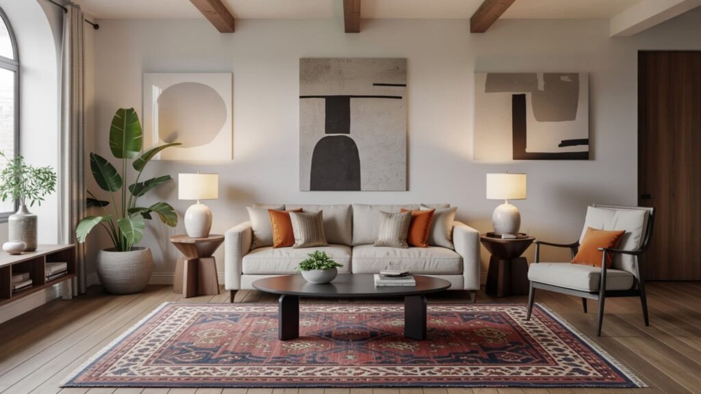
Rugs, art, and furniture, these three amigos, they really set the tone for your living room. You gotta balance the colors across all your textiles, walls, and accent pieces to avoid it looking like a kid’s art project gone wrong. Then there’s material selection. Pick stuff that’s durable where folks are walking a lot, and something with texture where you want a little more depth. Make sure the size fits the room’s proportions. Think about it. Each piece should have its moment without trying to steal the show from the others. The rug anchors, the art tells a story, and the furniture directs the flow. Consider repeating some shapes and keeping your color choices dialed back to unify the whole scene. Purposeful contrasts, like a soft throw next to a shiny metal lamp, add interest without making everything chaotic. Your goal here is to create a space that’s put-together, welcoming, and easy on the eyes.
Establishing a Palette That Bridges Textures
Establishing a color palette that bridges textures is like finding that perfect playlist where every song flows into the next. You’re picking colors that hold together your fabrics, walls, and accent pieces, making all those different surfaces read as one story. You want color harmony across your rug, sofa, drapes, and art. The tones should repeat, contrast, and have a little chat without anyone shouting. Start with a neutral foundation, like a solid concrete slab. Then, layer in some warm and cool notes to really show off the textures. Think plush velvets, matte wood, and shiny metals. Aim for material blending where the shift in sheen is intriguing, not jarring. The undertones should line up across different fibers and finishes, creating a sense of order. Subtle shifts in color add depth. Deliberate contrast keeps things balanced. The end result should feel put-together, good to touch, and refined. It’s about inviting effortless, lasting interaction with every surface, like a well-worn baseball glove.
Choosing the Right Rug to Ground the Space
Grounding the room starts with a rug, the MVP of your floor space, that anchors the color palette and guides where people walk. You’ll pick a rug that works with your furniture shapes and echoes your color scheme. It shouldn’t overwhelm the room like a loud tie at a quiet dinner. Scale is super important here. Line the rug up with your seating or use it to define different areas without cramming everything in. If you’re mixing patterns, do it on purpose. Pair a bold pattern with some quieter textures to create depth, then balance it out with solid colors so it doesn’t look like a digital glitch. Texture matters a lot too. The way it’s woven, how high the pile is, and the fiber. All that shapes how light bounces around and how the room feels. Go for durability if it’s a high-traffic zone, but still keep it soft underfoot. With a little thought, that rug will ground the space and tie your whole design together.
Artwork as a Narrative: Focal Points and Flow
Artwork is like the room’s storyteller, leading your eyes from one moment to the next. You’ll design focal points that get conversations going and move people through the space. Choose one main piece of art or a grouping of them as your visual compass. Then, arrange the other pieces to support that clear flow. Color coordination is key here. Let those colors pop up again thoughtfully to connect furniture, rugs, and art without making your eyes feel overwhelmed. Consider adding cultural touches to give it more meaning. Symbols, patterns, or traditions that resonate with you and your guests while still fitting in. Don’t let it get cluttered. Invite a little variation. A well-thought-out sequence creates rhythm and emphasis. It tells a living story that you get to be a part of every day.
Furniture Layout: Balance, Scale, and Conversation Zones
When you’re laying out the room, balance and scale are your trusty guides. Chairs, sofas, and tables should all get along in terms of size and proportion. They shouldn’t be fighting for attention like siblings over the last slice of pizza. The way you place your furniture should direct foot traffic, guide where your eyes go, and make folks comfortable. Seating arrangements should invite conversation, not make people feel like they’re packed into a crowded elevator. Put sofas across from chairs to create a natural conversation circle. Define a clear focal point, but don’t block the pathways. Give coffee tables and media consoles plenty of room to breathe. Use different heights to keep things interesting, but still aim for harmony. Go for groupings that make sense, leave some intentional empty spaces, and make sure your layout can adapt for parties or just chilling out.
Texture, Light, and Contrast for Visual Rhythm
Texture and light are like a well-rehearsed band, working together to guide your eye. They balance the tactile interest with just the right amount of brightness across your rugs, art, and furniture. Contrast makes the rhythm sharper, while layering textures adds depth without making it feel like a junk drawer. Start by figuring out where warmth, shine, and patterns all come together to create a cohesive, energetic room.
Texture and Light Balance
The balance of texture and light in a living room really depends on contrast. This contrast guides your eye and sets the mood. By mixing different tactile surfaces with various lights, you create a visual rhythm that feels intentional, not just some happy accident. You’ll notice how deep the texture is on rugs, upholstery, and art. Then there’s the light, shaping shadows and highlights across fabric patterns. Focus on color coordination so your neutral tones play nicely with accent colors. This enhances the contrast without being distracting. Use layered lighting, like ambient, task, and accent lights. These reveal texture without creating a harsh glare. Balance your soft and hard surfaces so nothing falls flat. Let texture and light lift each other up for a cohesive, calm energy.
Contrast for Visual Rhythm
Contrast in a living room is all about directing your eye with a little purposeful tension. Light and texture team up to create a rhythm that feels deliberate, not random. You balance this contrast by calibrating the colors, how shiny things are, and their forms. This way, the lines you create direct attention without making you feel like you just stubbed your toe. Texture adds something you want to touch, while light shows off how deep it is. Your eye follows a sequence, not just chaos. Aim for colors that get along across your rugs, art, and furniture. Then, introduce pattern mixing like a controlled conversation. Two or three patterns, sized appropriately. Keep the progressions crisp. Avoid overloading the senses. When it’s done right, contrast becomes a quiet conductor, shaping the mood, the pace, and the visual rhythm with real intent.
Layered Texture Dynamics
After you’ve figured out how contrast guides your eye, layered texture dynamics come in to add even more depth. This is where you pair tactile surfaces with light. You blend fabrics, weaves, and finishes to create a subtle momentum across the room. Texture isn’t just about looking good. It directs how you perceive things, catching, reflecting, and changing how light glows. Think about how mixing patterns can create rhythm without making it feel like your computer screen just froze. And how color coordination keeps everything grounded. Let your rugs, throws, and upholstery echo or play against your wall art and furniture lines. Then, let the highlights dance off metals or matte woods to really make things pop. The result is a cohesive tempo. Layered, touchable, and visually clear, yet still quietly sophisticated.
Accessorizing With Purpose: How Small Details Tie in
Accessorizing with purpose means every little detail has to earn its keep. You see your living room as a story, and the decorative accents are like the punctuation marks, not just random clutter. Pick pieces that echo the rug’s colors or the art’s patterns. This creates a quiet conversation instead of a competition. Think about how you’re using light to enhance both function and mood. Maybe a dimmable wall lamp next to a favorite print, or a table lamp to create some nice shadows. A subtle floor light can anchor your seating area. Keep the size of things in mind, and don’t overdo it by repeating the same material or color too much. With a little restraint, every detail reinforces balance, clarity, and a polished, inviting vibe. It’s like a well-oiled machine, every part working together.
Spatial Cohesion: The Finish Line of a Polished Living Room
Spatial cohesion is what brings your rug, art, and furniture together into one finished room. You line up all the elements by color, texture, and size, so nothing looks out of place. Color coordination guides your eye through the space, creating a quiet rhythm that anchors your focal points without screaming for attention. Lighting techniques finish off the look, shaping the mood and depth while showing off textures with flattering clarity. Limit your contrasts to intentional pairings. Let some negative space breathe. This prevents it from feeling crammed. Your choice of frames, fabrics, and finishes should show up again across different areas, tying your seating, surfaces, and art into a unified whole. When everything feels like it belongs, that’s when you know you’ve got a polished living space that speaks with a confident, unified voice.
Conclusion
Alright, you’ve anchored this room like a pro, pairing the rug, art, and furniture into one single, cohesive story. The grounding textures meet a carefully chosen color palette, and that rug isn’t just soaking up footfalls, it’s defining your zones. The art is like your personal tour guide, showing you around the room. The furniture balances out the scale, and conversations are flowing easily around those deliberate layouts. You’ve layered light, contrast, and tactile details to keep that rhythm going strong. Even the smallest accents are pulling their weight, connecting the little things to the bigger pieces. When everything feels effortless, you’ve hit the jackpot. You’ve got a polished living space that speaks in a confident, unified voice, like a well-practiced band hitting all the right notes.
Leave a Reply