I have been, or can be if you click on a link and make a purchase, compensated via a cash payment, gift, or something else of value for writing this post. As an Amazon Associate, I earn from qualifying purchases. Please read my full Affiliate Disclosure for more information.
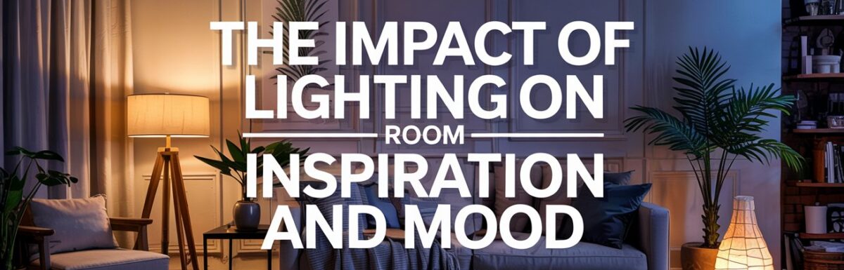
You’ll transform any room by shaping lighting to match the mood and tasks you value, using warm tones for coziness, cool tones for focus, and layered light—ambient, task, and accent—to create spaces that feel intentional and inspiring. Color temperature guides perception, while brightness tunes energy and calm. Layering light adds depth, flexibility, and rhythm, so you can adapt for work, relaxation, or social time. Keep exploring how the right setup unleashes your space’s full potential.
Key Takeaways
- Color temperature shapes mood: warm light creates coziness, while cool light boosts focus and energy in a room.
- Layered lighting enhances mood and function: ambient, task, and accent lighting work together to guide perception and activity.
- Brightness and natural light drive emotion and behavior: dimmer settings calm, brighter settings energize; daylight influences color perception.
- Color rendering accuracy preserves realism: true hues reveal textures and improve design confidence, influencing inspiration.
- Purposeful lighting design fosters atmosphere: thoughtful placement and dimming options support inviting, inspiring spaces for different activities.
Understanding Color Temperature and Its Effects
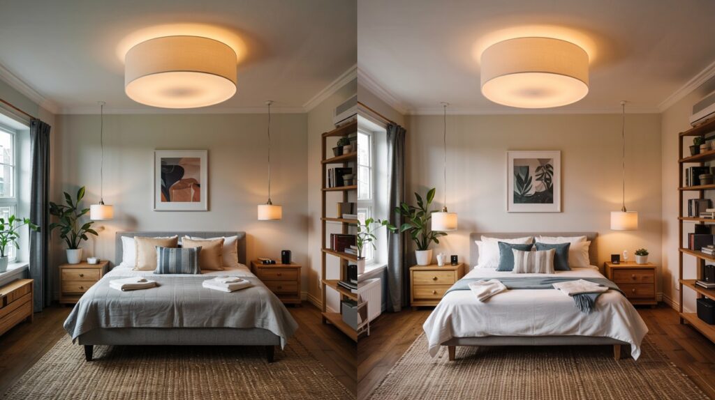
Color temperature is the quality of light that tells you how warm or cool a space feels, and getting it right can change the mood before you even move a piece of furniture. You’ll discover how warmer temps (about 2700K–3000K) feel cozy and inviting, while cooler temps (4000K–6500K) sharpen focus and energize spaces. The color temperature you choose guides perception, influencing fabric colors, textures, and perceived room size. This is a practical tool: select a temperature that aligns with your intended mood, and watch the mood influence shape your daily routines, conversations, and creativity. You’ll gain clarity, consistency, and purpose. color temperature, mood influence.
The Pillars of Lighting: Ambient, Task, and Accent
Ambient, task, and accent lighting form the three pillars that shape how a room feels and functions. You’ll use them together to support flow, focus, and mood without clutter. Ambient light provides broad, even coverage so you don’t stumble in dim corners. Task lighting targets reading, cooking, or desk work, boosting clarity where precision matters. Accent lighting highlights architectural features or artwork, adding depth and personality. Think in terms of lighting patterns rather than a single source, and plan fixture placement to balance shadows and glare. With intention, you create a space that feels effortless, organized, and purposefully inviting.
How Brightness Shapes Perception and Mood
Brightness is more than a technical spec—it’s a lever you can pull to shape how a room feels and how you behave in it. When you adjust brightness, perception shifts: tasks feel easier, moods calm, and spaces invite focus or pause.
- Dim the glow to reduce glare and invite contemplation
- Increase brightness to energize mornings and boost clarity
- Use dimming options to shift between work and relaxation
- Let natural light guide color perception and mood throughout the day
Ambient strategies respect natural light, aligning with purpose and comfort.
Layering Light to Create Flexible Spaces
Layering light is the practical way to keep a room adaptable for different tasks and moments. You’ll combine ambient, task, and accent layers so spaces feel calm or energizing as needed. Dimmer switches let you dial mood without changing fixtures, preserving equality of function and atmosphere. Add smart lighting for schedules, scenes, and voice control, turning a single room into multiple personalities with ease. Use layered fixtures to define zones—the sofa area, desk nook, or reading corner—without crowding the eye. Practical, aspirational design emerges when light serves purpose, comfort, and subtle inspiration in daily life.
Color Rendering and Accurate Room Realism
When you choose lighting with strong color accuracy, you’ll see true hues in every corner of the room. This matters for realistic illumination and helps you trust how fabrics, paints, and decor actually read under your light. Start by prioritizing sources that render true colors and evaluate how your space feels as colors stay consistent from mood to task.
Color Accuracy in Lighting
Color accuracy in lighting matters because it determines how true colors look in real life and in photos, influencing how you judge a room’s mood and realism.
- Ensuring color perception stays faithful helps you pick palettes that resonate with intent.
- Achieving visual harmony means choosing light that complements furniture, textiles, and artwork.
- Calibrating color temperature with purpose keeps scenes cohesive rather than discordant.
- Evaluating rendering accuracy lets you preview spaces that feel authentic, not altered.
You’ll design with intention, using precise lighting as your guide to honest ambience and confident choices.
Realistic Room Illumination
Realistic room illumination hinges on color rendering that faithfully reproduces hues and contrast, so the space feels authentic in every moment. You prioritize lamps and fixtures that balance warmth, neutrality, and brightness to reveal texture and depth without distortion. In practice, aim for a consistent color temperature and render quality across tasks, from reading to relaxing. Dusk simulation helps you preview evening mood, while shadow play clarifies depth and form, reinforcing realism. Keep fixtures calibrated and dimmable, so you can adjust scenes quickly. This approach empowers you to design environments that look honest, feel inviting, and support focused, inspired living.
Rendering True Colors
Think about how true colors anchor a room’s mood: rendering accurate hues and subtle shifts is what makes spaces feel honest and alive. You’ll pursue color fidelity to keep tones true, even under different lights, so the room remains visually authentic. With practical steps, you’ll understand how rendering choices influence perception, not just aesthetics.
- Calibrate lighting to protect color fidelity and reveal nuances
- Compare swatches under your main light to ensure visual authenticity
- Choose fixtures that minimize color distortion for key elements
- Test fabrics, paints, and materials at typical viewing times for consistency
Practical Fixture Selection for Different Rooms
When selecting fixtures for each room, start with the tasks you regularly perform and the mood you want to set, then choose lighting that supports those needs without overpowering the space. In practice, match fixture styles to function: task lighting for desks, ambient glow for living areas, and focused accents for artwork. Consider lamp placement to balance shadows and highlight favorites without glare. For kitchens, opt for bright, evenly distributed light at work surfaces. In bedrooms, use layered lighting to ease transitions between routines and wind-down. Keep controls simple, scalable, and energy-efficient to sustain inspiration across rooms.
Balancing Function and Ambience in Layouts
You’ll aim for layouts that serve daily tasks without sacrificing mood, letting function guide placement while ambience softens the edges. Consider how space flow connects zones—traffic paths, sightlines, and habit patterns—to keep rooms inviting yet efficient. As you balance practicality with atmosphere, you’ll create rooms that feel purposeful and inspiring at the same time.
Function Meets Ambience
Balancing function and ambience means designing spaces that work hard without feeling sterile. You want rooms that support tasks while feeling welcoming, so every choice earns emotional resonance and aesthetic harmony.
1) Prioritize layout zones that align with daily routines and emotional needs.
2) Use lighting layers to soften work areas without sacrificing clarity.
3) Choose furniture with tactile comfort that also supports function.
4) Let color and texture reflect your mood goals, not just trends.
You’ll notice tasks flow more smoothly when ambience nudges you toward calm, focused energy. Your space becomes both practical and inspiring, a canvas that supports daily creativity.
Space Flow Balance
Achieving space flow balance means designing layouts where function and ambience support each other, not compete. You’ll create routes that guide movement, seating that invites conversation, and surfaces that support tasks without clutter. Prioritize spatial harmony by aligning zones for work, rest, and circulation, so lighting accents enhance cues rather than distract. Let furniture scale, rhythm, and sightlines choreograph a calm aesthetic flow, ensuring each element serves a purpose and contributes to mood. Use lighting as a unifier—bright where needed, softer to invite relaxation. This balance yields rooms that feel purposeful, inviting, and inspiring in everyday life.
Conclusion
In your space, lighting isn’t just illumination—it’s mood, focus, and inspiration all rolled into one. You’ll tune color temperature for comfort, layer ambient, task, and accent to flex with your days, and use brightness to steer perception and energy. Balance function with ambiance, select fixtures thoughtfully, and trust layering to transform rooms on demand. With intention and a few practical tweaks, you’ll craft environments that feel both grounded and aspirational, ready to fuel creativity and calm.
Leave a Reply