I have been, or can be if you click on a link and make a purchase, compensated via a cash payment, gift, or something else of value for writing this post. As an Amazon Associate, I earn from qualifying purchases. Please read my full Affiliate Disclosure for more information.
Here’s the thing. You’ve got to start with a neutral backbone in your space. Think of it like building a solid foundation for your house, before you go painting the exterior a wild color. Ground those walls, floors, and big furniture pieces in warm beiges, cool grays, or soft taupes. Then, you can layer on the patterns and textures in ways that feel controlled, like a carefully planned play call.
Choose one dominant motif and let it do the heavy lifting, then support it with solids. This lets the room breathe, rather than feeling like a chaotic yard sale. Mix textures like velvet, linen, and jute, and vary the scale. Using bold prints only as accents on a chair, a pillow, or a feature wall is like a perfectly timed dunk in a basketball game. If you keep pattern quiet everywhere else, you’ll feel calm, and there’s more to uncover, which is always a bonus.
Key Takeaways
- Start with neutral foundations. Use large neutral surfaces and textures to ground patterns and keep things from getting too busy.
- Establish a clear pattern hierarchy. One big pattern, a few supporting acts, and a whole lot of solids.
- Use restrained pops of color. Pull those accent hues right from your main pattern to make sure everything feels connected.
- Vary textures, not just colors. Mix velvet, linen, and woven stuff. This adds depth while keeping your solids, well, solid.
- Create rhythm with scale and spacing. Alternate between big and small motifs. Leave some breathing room between those pattern clusters.
Anchoring With Neutrals: Foundations for Balance
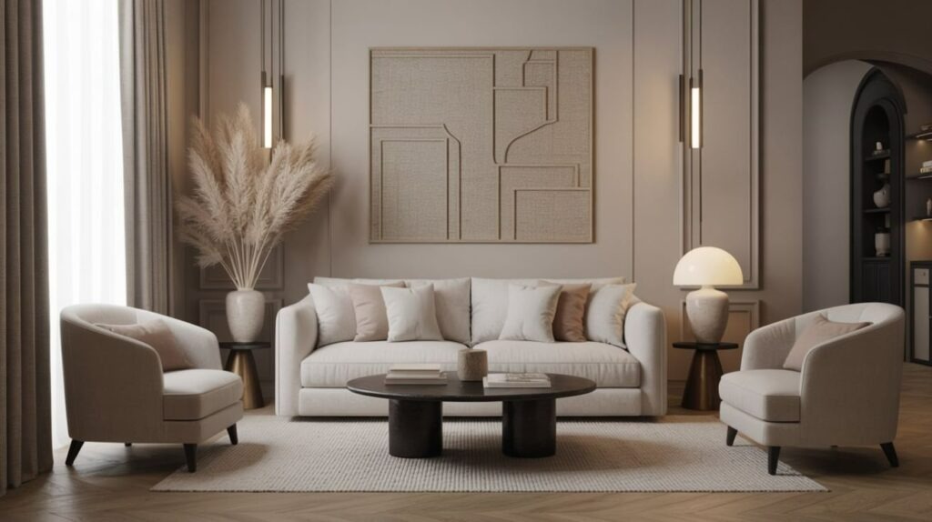
Neutral tones are like the unsung heroes of interior design. They anchor those busy patterns and bring a real sense of visual calm to a room. You’re going to start with neutral foundations. Consider them the backbone of your design balance, picking shades that feel like a calm ground rather than screaming for attention.
Think warm beiges, cool grays, and soft taupes. These colors play nice together. They harmonize instead of competing like rival sports teams. The reality is, you want to use color anchoring by pairing those neutrals with measured accents. This lets your eye rest before it travels, like taking a pit stop on a long drive.
I mean, come on. Keep your textures deliberate. Woven, matte, or lightly textured surfaces feel tactile and solid. In practice, put your larger neutral surfaces in first, then sprinkle in small bursts of color sparingly. This approach keeps things clear, cuts down on clutter, and helps maintain a cohesive room rhythm. It’s all about making sure your decor isn’t giving you a headache.
Building a Cohesive Color Palette Across Elements
Okay, so you’ll pick a core color you absolutely love. Let that color be the anchor for everything, from fabrics to finishes and furniture. This makes sure all your hues tell one story, not a bunch of disconnected tales. You’ll use Palette Anchors and Accents to figure out where to repeat and where to contrast.
This keeps your Color Harmony Across Elements tight and intentional. Think about it. You’re balancing Proportion and Pattern so the palette actually supports your texture. It’s not supposed to overwhelm it, like a loud neighbor at a quiet barbecue.
Opening: F | Mood: 1 | Humor: unexpected comparisons, blue-collar refs, tech frustrations | Trans: A | Rhythm: 3 | Constraints: Max 2 questions, No parentheticals
Color Harmony Across Elements
Color harmony across elements starts with a core palette and some seriously deliberate distribution. Pick one dominant color, then two supporting hues, and finally, an accent that really pops. You then translate this into every surface and texture, balancing pattern contrast and color blocking for pure cohesion.
- Establish one main color, then layer with two supporting hues in your textiles and finishes.
- Use color blocking to separate zones. This means large panels, furniture, and decor, so your colors don’t clash like two drivers fighting for the same parking spot.
- Apply an accent sparingly. This unifies contrast, tying patterns to solids without making the room feel crowded.
This approach gives you rooms that feel tactile and organized, with a clear, quiet rhythm. It’s like a well-oiled machine, but for your living space.
Palette Anchors and Accents
Palette anchors are your stable core. From this core, you build out everything else. You’ll align key tones across all your elements, then bring in accents that reinforce that core without overpowering it. Consider this: color blocking to separate zones. A bold block can anchor sofas, curtains, and rugs, while lighter neutrals drift across walls and ceilings.
Use monochromatic schemes to unify textures. Different fabrics, but all in the same value range, for that sweet, sweet cohesion. Accents are there to amplify the palette with predictable contrast, not chaos. A single warm hue repeated in cushions, vases, and throws ties a room together. This method keeps your patterns in check while preserving visual rhythm and clarity. You don’t want your living room to look like a confused clown car.
Proportion and Pattern Balance
Proportion dictates how much each pattern screams for attention in a room, so balance starts with scale. You want to align your pattern scale with the room’s rhythm, letting larger motifs fade as you add smaller details. This keeps color saturation focused, avoiding that dreaded visual fatigue. Nobody wants their eyes tired after just walking into a room. It also helps maintain depth.
You’ll get cohesion by repeating a unifying element. Maybe a quiet stripe in varying scales across textiles and surfaces. Precision is key. Measure those swatches, compare them, adjust everything, and then preview it all under different lighting. When in doubt, pare back. Let solids ground the pattern drama, like a strong offensive line protecting the quarterback.
- Establish a dominant pattern at a readable scale.
- Layer with mid-scale accents and subtle textures.
- Titrate color saturation for harmony.
Layering Patterns Through Textiles and Art
Think of textiles as the glue that holds everything together. They weave color and texture across spaces. This keeps patterns anchored instead of fighting for attention. Try pairing a bold throw with some quieter cushions. This lets one motif make a statement while the others just whisper around it, like a good backup singer.
In your art, layer prints and paintings with varied scales to create depth. Use repetition to unify those different pieces without making the room feel packed. It’s all about making sure everything looks intentional, not accidental.
Textiles as Ties
Layering patterns through textiles and art is how you tie a room together. It’s about speaking a shared rhythm, so those textiles act as the bridge between prints and solid grounds. You’ll feel that cohesion when fabric textures repeat the same cadence across surfaces, tying bold patterns to those calm foundations.
1) Use a dominant textile with a subtle pattern to establish texture. Do this without overwhelming the room. Think of it as a quiet leader.
2) Vary your fabric textures. Velvet, linen, cotton. This makes sure tactile prompts echo across chairs, throws, and curtains. It’s like a consistent beat in a song.
3) Pair prints with solid grounds that absorb color and light. This allows textile layering to guide eye movement and balance. It’s a subtle art, like a good defensive play in football.
Artful Pattern Play
Patterns can really dance across surfaces when you mix textiles with art. This creates a living rhythm that anchors a room without ever having to shout. You want to layer motifs thoughtfully. A striped rug grounds the space, a geometric print echoes on a throw, and a monochrome canvas offers that much-needed calm. It’s like a well-choreographed dance, not a mosh pit.
Seek out pattern contrast by pairing bold, tight repeats with softer, larger forms. This ensures no single element overwhelms the others. Align your palettes to keep visual cohesion. Repeat a shared hue across textiles and wall art. Let texture determine emphasis. Weave, weave-taint, and lacquered surfaces add tactile depth. Space items deliberately. Every piece should reinforce balance, not compete for attention. You don’t want your living room to feel like a yelling match.
Scaling Motifs for Visual Rhythm
Scaling motifs is how you create visual rhythm. It’s all about varying size and proportion across a space. You’ll notice how smaller details play against larger forms. This guides your eye without anything ever shouting for attention. It’s a subtle art, like a good poker face.
By adjusting the motif scale, you literally create a tactile tempo. This unifies textures and surfaces. It makes a room feel intentional, not just a random collection of stuff. Consider this: your living room shouldn’t look like a tornado just went through a furniture store.
- Vary motif sizes across zones. This helps balance your focal points and gives the eye a place to rest.
- Pair large anchors with smaller repeats. This modulates the visual weight, like balancing your grocery bags.
- Test the rhythm by walking the room. Note the dominant scales.
- Motif scaling and visual rhythm intersect when proportion serves a purpose. It’s not just about looking pretty, but about function too.
Repeating a Dominant Motif Across Pieces
A dominant motif shouldn’t just pop up once and disappear. It needs to travel through every piece you pick. It’s like a recurring character in a good TV show. When you choose textiles, lighting, and furnishings, make sure that motif repetition feels deliberate. You don’t want it to seem like a happy accident.
Tie chairs, rugs, and drapery to the same silhouette or curvature. This makes sure your pattern dominance reads as a single narrative, a cohesive story. Let scale and spacing harmonize. A bold motif on a pillow can echo in a lampshade without competing. A smaller version on curtains reinforces that continuity. Maintain tactile clarity. Surfaces should invite touch and avoid visual clutter. When it’s done right, cohesion comes from purposeful repetition, not just forced matching. It’s like a well-practiced band, every instrument playing its part.
Reserving Bold Patterns for Accent Moments
Bold patterns are like the star players on a team. They should have their moment, not be shouting all the time. You’ll use bright motifs sparingly. Let one bold print or geometric pattern anchor the eye’s path in a space. This leads to sharper contrast, with texture and color doing the talking in measured, tactile breaths. It’s like a perfectly executed solo in a song, not a constant blast from every instrument.
Bold Pattern Highlights
When you keep those bold patterns for accents, they really punch up a room without ever overwhelming it. Bold pattern highlights create focal moments. These feel intentional, not chaotic. They guide your eye with crisp contrast. Use statement wallpapers sparingly, always pairing them with solid backdrops to keep that calm balance. It’s like a good comedian. They know when to deliver the punchline, and when to let the audience breathe.
- Place a single wall behind a seating area. This anchors the space with a bold pattern highlight.
- Choose one furniture piece in a bold motif. Keep other surfaces quiet.
- Add color accents drawn from the pattern. This unifies the room without crowding it.
- It’s all about making a statement, without being a loudmouth at the bar.
Accent Moment Strategy
Accent moments are how you keep those bold patterns from shouting. You save the loud prints for intentional spots. This lets calm solids hold the room together. When a statement textile appears, it anchors the eye and guides the flow. It’s not competing everywhere like everyone trying to talk over each other at a family dinner.
Use pattern layering sparingly. A chair back, a throw, or a rug can hint at personality without overwhelming surrounding surfaces. Pair those moments with color blocking in adjacent pieces. This makes sure tones repeat with restraint. This strategy creates rhythm without clutter. You’ll notice texture, light, and shadow gain depth, while your eye travels with ease between accents and resting planes. Precision is how you sustain cohesive, inviting rooms. It’s like a finely tuned engine, every part working together.
Sparse Pattern Balance
Sparse pattern balance is about trimming those loudest prints. Give them their designated moments. Let quiet textures and solids do the heavy lifting everywhere else. You create calm by saving those bold motifs for accents. Meanwhile, surfaces stay restrained, tactile, and deliberate. It’s like a good poker player. They know when to show their hand and when to keep it close to their chest.
- Practice minimalist clutter. Choose simple silhouettes and limit decorative elements to just a few focal spots.
- Embrace pattern juxtaposition. Use one quiet texture pairing per room. This reinforces contrast without overwhelming everything.
- Use scale and spacing to keep the rhythm steady. This makes sure bold prints feel like intentional punctuation, not just background noise.
Integrating Texture to Enhance Depth
Texture isn’t just about what something looks like, it’s depth you can actually feel. You’ll anchor rooms by pairing textures with purpose, not just throwing a bunch of stuff together. Start with textural layering. Combine velvet, linen, and woven jute to sculpt visible depth without crowding the space. It’s like a good stew, all the ingredients working together.
Vary the sheen and fiber weight. This makes sure light and shadow play across surfaces, guiding your eye. Introduce tactile contrast where you want to put emphasis. Rough barkcloth against smooth ceramic. Or a ribbed knit beside a sleek leather chair. Maintain balance by keeping solids as grounding anchors. This lets your pattern breathe. This approach heightens perception, giving you a cohesive, inviting space that feels confident and refined. It’s the difference between a garage band and a symphony orchestra.
Leave a Reply