I have been, or can be if you click on a link and make a purchase, compensated via a cash payment, gift, or something else of value for writing this post. As an Amazon Associate, I earn from qualifying purchases. Please read my full Affiliate Disclosure for more information.
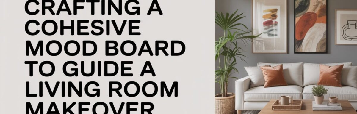
To craft a cohesive mood board for a living room makeover, start by defining your core vibe and goals. Then, establish a dominant color palette with supporting neutrals. Gather visual inspiration that reflects your mood and test it under different lighting. Choose textures and silhouettes that align with room size and traffic flow, and map a practical layout early. Curate lighting, accessories, and scale thoughtfully to maintain balance. If you keep exploring, you’ll uncover deeper cohesion cues.
Key Takeaways
- Define the living room’s usage and mood: comfort, flow, focal points to guide mood board direction.
- Establish a cohesive color palette with core hue, neutrals, and lighting tests under different conditions.
- Curate textures, materials, and silhouettes that align with room dimensions, scale, and traffic flow.
- Include furniture layouts and wall art concepts that reinforce rhythm, balance, and sightlines.
- Document decisions, rationale, and practical constraints to ensure repeatable, scalable cohesion.
Defining Your Core Vibe and Goals
Defining your core vibe and goals is the compass for your living room makeover. It’s like setting the GPS for your weekend road trip. You’ll translate personal taste into measurable criteria, narrowing options without sacrificing function. Start by identifying how you actually use the space: is it for daily living, entertaining, relaxation, or maybe even those dreaded work tasks.
Define tone—calm, energetic, minimalist, or luxe. Then, set objective benchmarks for comfort, scale, and flow. Align furniture arrangement with movement patterns, sightlines, and focal points, ensuring accessibility and balance. Wall art choices are like the cherry on top. They are not just mere decoration. They are anchors for color and mood. Document priorities, then validate choices against the plan to maintain a cohesive, purposeful result.
Picking a Dominant Color Palette
Choosing a dominant color palette sets the tonal backbone of your living room. It balances Palette Impact with the room’s lighting and scale. Use Color Harmony Guide principles to establish a core hue with supporting neutrals or analogous accents that reinforce the overall mood. With clear constraints, you’ll create a cohesive foundation that guides all subsequent material, furniture, and accessory decisions.
Palette Impact Basics
Selecting a dominant color palette sets the tonal foundation for the entire living room. It’s like picking the base coat for your car. It guides both materials and mood with clarity and cohesion. You’ll translate room function into color by prioritizing undertones that align with daylight and traffic. Color psychology informs perceived warmth, calm, and energy, while cultural symbolism guides intentional accents without stereotype. Start with a dominant hue and a controlled secondary range to preserve harmony. Use neutral anchors for balance. Test swatches under lighting at different times, and note how textiles read against walls. Document choices with rationale to guarantee consistent application across furniture, decor, and surfaces. This approach yields cohesive, purposeful rooms.
Color Harmony Guide
A well-balanced dominant color palette anchors the room’s mood and guides every material choice, from upholstery to accents. You’ll pick a primary hue grounded in color psychology. This ensures it supports your target vibe. Then, test contrast for readability and depth, balancing light and dark values to avoid flatness. Consider artificial lighting and its effect on color perception. Think ceiling warmth versus cool task lighting. Select a palette that remains coherent under varied illumination. Build harmony with 2-3 supporting tones that reinforce the dominant color without competing. This creates a cohesive, scalable scheme that adapts across textures and finishes.
Gathering Visual Inspiration and Themes
Gathering visual inspiration and themes sets the foundation for a cohesive mood board. It translates color, texture, and form into a unified direction. You curate references that reflect your intended atmosphere. This ensures consistency across sources. Focus on core motifs, scale, and rhythm to shape a recognizable narrative. Translate inspiration into actionable concepts: dominant hues, lighting scenarios, and silhouette language. Consider how furniture arrangements create flow and focal points. Decorative accents punctuate the palette without overpowering it. Align visuals with practical constraints, such as room size and traffic patterns, to maintain balance and clarity throughout your mood board.
Exploring Textures and Materials
You’ll start by layering natural textures to add depth without overpowering the space. It is like adding the right amount of seasoning to your favorite dish. Use material contrast techniques to balance soft fabrics with denser surfaces. This creates tactile interest and visual rhythm. This approach sets a cohesive foundation for your living room mood board, guiding future choices with clarity and purpose.
Natural Textural Layering
Natural textural layering brings depth to a living room. It pairs tactile surfaces with visual contrast. This allows materials to tell a cohesive story. You’ll blend textiles, woods, metals, and ceramics so each element contributes texture and temperature. Prioritize a deliberate hierarchy. Larger, softer textures anchor the space, while smaller, crisp surfaces punctuate with subtle shine. This approach creates tactile interest across zones, guiding movement and perception without crowding sightlines. Consider grain direction, weave density, and finish sheens to ensure consistency. When executed with intention, textural layering reinforces mood. It supports a calm, sophisticated aesthetic that remains engaging and informative.
Material Contrast Techniques
Material contrast techniques hinge on balancing tactile diversity with visual harmony. Textures and materials play off one another rather than compete for attention. You’ll blend fabric patterns with solid surfaces, layering depth without visual clutter. Focus on surface finishes—matte versus gloss, brushed versus smooth. These control light reflection and perceived weight. Pair natural fibers with engineered textures to create rhythm. Then, calibrate scale to maintain cohesion across the room. Document material choices in a grid. This notes how each element contributes to mood, durability, and ease of maintenance. The result is a purposeful, enduring living space with refined, intentional contrast.
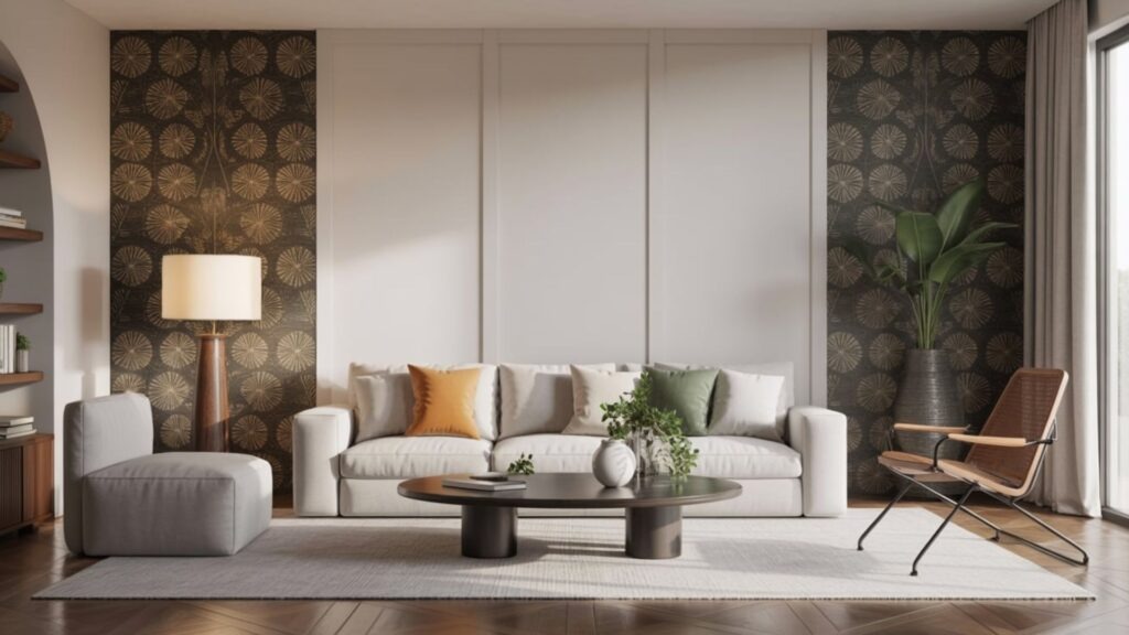
Silhouettes and Scale: Selecting Furniture
Selecting furniture silhouettes and matching scale to your space sets the foundation for a cohesive living room. So, start by evaluating room dimensions, ceiling height, and traffic flow. This determines the maximum sofa length, chair widths, and clearance you can comfortably accommodate. You’ll align architectural details with your pieces. Prioritizing balanced proportions and functional silhouettes is key. Consider furniture silhouettes that echo room geometry while preserving walkways and sightlines. Test scale with a mock layout. Then, fine-tune dimensions to avoid crowding. Maintain cohesion across finishes and textures. This ensures every silhouette supports a unified mood and practical accessibility. Wait. Hold on. This is like trying to fit a king-size mattress into a studio apartment. You gotta measure first.
Lighting as a Design Element
Lighting isn’t just a fixture you turn on. It’s a design element that shapes mood, defines space, and ties the room’s silhouette to its function. You’ll evaluate lighting in two layers: ambient glow for overall clarity, and task-specific illumination for focused activities. Choose fixture styles that echo your furniture lines, materials, and color temperature to maintain cohesion. Consider dimmable options to modulate atmosphere across time and use. Balance ceiling, wall, and ambient sources to avoid harsh shadows or flat rendering. Document placements on your mood board. Link each option to the intended zone, function, and emotional impact. It is like having a dimmer switch for your whole life. You can turn it up or down depending on what you need.
Layout and Spatial Flow Mapping
To create a cohesive living room that feels intentional, start by charting routes and zones. These support daily activities, conversation, and movement between furniture groups. Layout and spatial planning translate your mood board into usable space. It balances furniture placement with traffic flow. Map clear paths from entry to seating. This ensures doors and aisles stay unobstructed. Define focal points and sightlines that guide furniture alignment without crowding. Prioritize multi-functional zones, like a reading nook adjacent to a conversation cluster. Iterate measurements to prevent awkward gaps. Test circulation with scaled sketches to confirm efficient, relaxed interactions. This groundwork yields purposeful, harmonious interiors.
Curating Accessories and Accents
Curating accessories and accents is about elevating the mood board with purposeful, lightweight touches. These reinforce the room’s rhythm without competing with the main furniture. You’ll select items that mirror textures and tones already established. This ensures cohesion. Use restrained varieties, focusing on balance, proportion, and placement.
- Artificial plants anchor vertical rhythm and soften edges without maintenance burden.
- Decorative trays organize surfaces, define zones, and add subtle gleam.
- Textural accents—woven, ceramic, or metal—inject depth while preserving calm.
Implement as deliberate, non-obtrusive cues. Scale to furniture, group thoughtfully, and remove redundancies to maintain a clean, purposeful feel.
Assembling a Practical Mood Board Workflow
Crafting a practical mood board workflow picks up where curated accessories left off. It translates ideas into a repeatable process you can trust. You’ll establish inputs, outputs, and milestones that align with your design goals. Begin by outlining a core grid of inspiration, materials, and tonal ranges. Then, map connections between color psychology decisions and intentional finishes. Choose mood board software that streamlines asset collection, tagging, and versioning, reducing backtracking. Implement review checkpoints to validate cohesion, not just aesthetics. Document decisions, criteria, and rationale for future reference. This ensures a scalable workflow you can reuse across rooms and projects.
Conclusion
You’ve defined your vibe, chosen a cohesive palette, and gathered inspired textures. With silhouettes, scale, and lighting aligned, you’ve mapped a practical layout that supports daily life while elevating mood. Your mood board now serves as a precise, repeatable workflow. It bridges ideas and execution. As you translate concepts into real elements, stay iterative. Test, refine, and document decisions. Trust the process, because consistency and intention yield a living room that’s both technically sound and aspirational.
Leave a Reply