I have been, or can be if you click on a link and make a purchase, compensated via a cash payment, gift, or something else of value for writing this post. As an Amazon Associate, I earn from qualifying purchases. Please read my full Affiliate Disclosure for more information.
Look up for a second. Chances are, you’re staring at a flat expanse of “builder white” paint that you haven’t thought about since you moved in. I mean, come on, we spend months obsessing over rug textures and sofa colors. Yet, we completely ignore the biggest uninterrupted surface in the room. The ceiling isn’t just a lid that keeps the rain out. It is the silent partner in your design that controls how a room sounds, how the light hits, and whether you feel claustrophobic or free. It’s like the bass player in a band: always there, usually unnoticed, but everything falls apart without them.
Key Takeaways
- It’s the volume knob. Treatments absorb sound so your living room doesn’t echo like a high school cafeteria. Nobody wants to yell just to be heard in their own house.
- It’s visual trickery. Dark colors lower the lid for coziness, while light colors lift it off for breathing room. It’s like a good magician, making things appear or disappear right in front of you.
- Shadows create depth. Beams and trim give the eye something to grab onto so the room doesn’t feel like a sterilized box. Think of it as adding character, like a well-worn leather jacket.
- Practicality wins. Pick materials that can handle your climate and won’t need a ladder and a scrub brush every month. Because who has time for that after a long day of work.
- Cohesion is king. The ceiling should talk to the walls, not argue with them. You want a harmonious conversation, not a shouting match during family dinner.
Why You Need to Look Up
Let’s talk about why some rooms just feel wrong. You know the ones. You walk in and your voice sounds tinny, or the space feels cold despite the heater running full blast. That is usually a ceiling problem, plain and simple. Proper acoustics prevent your dinner party conversations from turning into a shouting match by cutting down the echo. No one wants to feel like they are in a gymnasium when they are just trying to catch up with friends.
Beyond the noise, there is the comfort factor. A well-insulated ceiling stops that weird draft that hits the back of your neck and keeps your energy bill from skyrocketing. It is about not having to wear a sweater indoors because your ceiling is doing its job. When you treat the ceiling as a functional layer rather than just a surface, you get a room that actually feels good to be in.
Setting the Mood from the Top Down
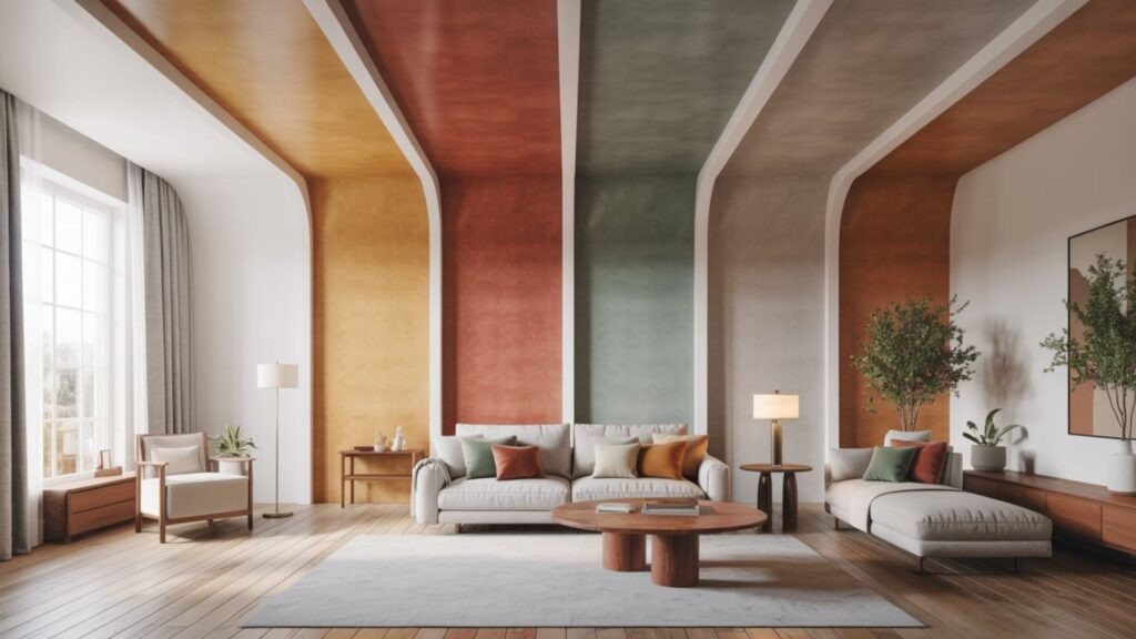
Color usually stops at the crown molding. That is a missed opportunity, big time. The shade and shine you put up there dictate the entire vibe of the space. You have to consider how the light plays off that surface. Does it bounce around and make the room feel electric, like a live concert, or does it get absorbed for a moody, lounge-like feel, like your favorite dimly lit bar?
This is about creating a relationship between your lights, your walls, and that big blank canvas above your head. It is like a dance, and every partner needs to be in sync. Okay, so.
The Mind Game of Color
Here is the psychology of it all. Bright whites push the ceiling away, making a cramped room feel like it has air. It is like finally being able to take a deep breath. Darker shades do the opposite. They pull the ceiling down. That might sound bad, but think about a cozy library or a theater. That compression creates intimacy. It feels like a warm hug, not a confined space.
Cool tones like pale blue mimic the sky, tricking your brain into seeing “openness,” while warm creams soften the harsh edges of a room. And don’t forget the finish. A matte finish hides a bad drywall job and feels soft. A satin finish adds a little sparkle but shows every imperfection. Choose wisely, or you will be staring at that mistake for a long time.
Texture is the Secret Sauce
Texture is how you control the light without buying new lamps. A completely flat ceiling can feel a bit sterile, like a hospital waiting room. Adding a tactile finish changes the physics of the room. It is a subtle shift, but it makes a world of difference.
- Diffusion. A bit of texture breaks up light so you don’t get harsh glare spots. No one wants to feel like they are constantly under a spotlight.
- Temperature. Rougher textures tend to feel warmer and more organic. It is like the difference between a smooth rock and a piece of driftwood.
- Character. It proves a human touched the space, not just a machine. It adds that personal touch that makes a house a home.
- Harmony. It connects the floor materials to the overhead view. Everything should be working together, not against each other.
Mastering the Glow
Think of your ceiling as a giant reflector. If you blast a stark white light at a glossy ceiling, you are going to feel like you are in an interrogation room. We want an ambient glow. Use warm whites to boost the cozy factor or cool tones if you need to focus and work. The trick is positioning. Recessed cans provide general coverage, but a pendant light creates a moment. It tells the eye “look here.”
Use dimmers. Always use dimmers. They let you change the room from “work mode” to “relax mode” in one second. It is like having a remote control for your mood.
Adding Depth and Drama
We need to get away from the idea that ceilings have to be boring. Pattern and texture add a layer of sophistication that paint alone just can’t touch. It creates movement. It makes the room feel finished. Here are a few ways to make that happen without tearing the house down:
- Plaster. Old school but effective. It adds a subtle shadow play. It is like a quiet wink from the past.
- Murals. Bold, yes, but in a small powder room. It’s a showstopper. It is an unexpected surprise that leaves an impression.
- Metallics. A gold or silver leaf accent reflects light in a warm, expensive way. It is like wearing a nice watch: subtle, but it catches the eye.
- Molding. Simple geometric shapes applied to the ceiling add rhythm. It is like a beat that keeps the room moving.
The Architecture of Interest
This is where we separate the basic rooms from the designed spaces. Panels, beams, and coves aren’t just decoration. They are architectural bones. Beams break up a large, cavernous space and make it relatable to human scale. It is like giving a massive open field some trees to break up the view.
Coves hide light sources, creating that magical “glow from nowhere” effect. These details guide your eye. They tell you where the center of the room is. They frame the space. It’s about adding personality without screaming for attention. It is a quiet confidence in the design.
Making the Light Work for You
You can have beautiful beams, but if you light them wrong, they just cast weird shadows. The lighting and the architecture have to date. They have to like each other. It is a balancing act between form and glow, a delicate dance of light and shadow.
- Go Indirect. Bounce light off the ceiling to highlight the architecture rather than shining it down on the floor. It is like painting with light, rather than just pointing a flashlight.
- Watch the Glare. If you have a textured ceiling, avoid harsh side-lighting that creates ugly shadows. No one wants their ceiling to look like a topographic map.
- Hide the Source. Cove lighting is your best friend here. It is the magician’s trick, making the light appear out of thin air.
- Layer It. Combine the practical overhead lights with softer, mood-setting accent lights. It is like having different gears for different occasions.
The Perception of Space
Real estate agents talk about square footage, but designers talk about volume. A low ceiling can make a big room feel tight. A high ceiling can make a small room feel grand. You can manipulate this. Painting the ceiling the same color as the walls blurs the boundary line, making the ceiling feel higher because your eye doesn’t know where the wall stops. It is like an optical illusion that works in your favor.
Conversely, a heavy crown molding defines the limit and grounds the space. It’s all about controlling where the eye stops traveling. It is about creating a sense of order and purpose. Here’s the thing.
The Echo Effect
Your ceiling shouldn’t look like it was airlifted in from a different house. It needs to echo what is happening on the ground. If you have rustic wood floors, maybe a clean, high-gloss modern ceiling isn’t the move. You want a conversation between the top and bottom of the room. It is like a good duet, where both voices complement each other.
Color Flow
Continuity is calming. When the ceiling plays nice with the wall color, the brain relaxes. It doesn’t have to process a stark contrast. It is a visual sigh of relief.
To nail this:
- The Wrap. Use the wall color on the ceiling for a seamless, box-like cozy feel. It is like a warm blanket wrapping around the whole room.
- The Fade. Use a version of your wall color cut with 50% white for a lighter, but related, look. It is a subtle nod, a gentle suggestion.
- The Accent. Pick up a color from your rug or art and put it overhead to tie the room together. It is the thread that connects all the pieces.
- Test It. Colors look different horizontally than they do vertically. Always test a swatch on the ceiling itself. Don’t trust your gut on this one.
Tactile Rhythm
This is the advanced class, folks. If you have linen drapes and a nubby wool rug, a super-slick plastic-looking ceiling will feel off. You want to match the “weight” of the textures. If the room is heavy and organic, the ceiling should have some grain or tooth to it. It is about creating a sense of balance.
If the room is sleek and minimal, the ceiling should be smooth as glass. It’s about keeping the rhythm of the room consistent so nothing jars you. You do not want a jarring note in your visual symphony.
Real World Logistics
We have to be realistic. You do not want to install something that requires a scaffolding team to dust. You have to balance the dream look with the reality of your life, your budget, and your home’s humidity levels. It is about being smart, not just stylish.
- Moisture Matters. In a bathroom or kitchen, standard materials will warp or mold. Go for moisture-resistant options. Unless you like surprise biology projects.
- Cleanability. Can you wipe it. If not, do you really want it in the kitchen where grease creates a film. Think about your future self and your future cleaning supplies.
- Structure. Real wood beams are heavy. Make sure your joists can actually hold them up before you buy. You do not want your ceiling to become a floor for the upstairs.
- Future-Proofing. Trendy colors are fun until you have to repaint a twelve-foot ceiling three years later. Sometimes classic wins for a reason. It is about longevity, not just fleeting fancy.
The Bottom Line
Stop treating your ceiling like a backdrop. It is a player in the game. It shapes the mood, fixes the sound, and finishes the story your furniture started. Whether you go with bold beams, a moody paint color, or just a really thoughtful lighting plan, giving the “fifth wall” some love is the quickest way to take a room from “fine” to “designed.” So grab a ladder and see what’s possible. Your ceiling will thank you.
Leave a Reply