I have been, or can be if you click on a link and make a purchase, compensated via a cash payment, gift, or something else of value for writing this post. As an Amazon Associate, I earn from qualifying purchases. Please read my full Affiliate Disclosure for more information.
To create a calming bathroom retreat, start with a cohesive palette of neutrals and soft pastels, pairing warm creams with dove gray and pale sage. Choose textures that feel tactile yet calm—matte stone, warm timber, woven fibers—balancing finishes to avoid glare. Layer with one bold but restrained accent, plenty of soft textiles, and concealed storage to keep sightlines clean. Use even lighting to flatten shadows and unify surfaces. If you want more detail, there’s more you can explore.
Key Takeaways
- Start with soothing neutrals and gentle pastels, balancing saturation with white and natural textures to avoid heaviness.
- Choose earthy hues (ochre, sage, dove gray) and layer textures like matte stone and warm timber for warmth.
- Use one bold accent motif with supporting textures and subtle metallics to maintain cohesion.
- Layer materials (ceramics, natural fibers, towels, baskets) and plan storage to keep sightlines calm and uncluttered.
- Test colors under daylight and artificial light, lay swatches together, and refine until the palette feels serene and unified.
Understanding Your Space and Light
Understanding your space and light is the first step to choosing calming colors and textures. You map layout, light sources, and daily routines, noting where glow shifts with time. Identify dominant lighting effects—from soft ambient to focused task light—and how they change mood. Consider ceiling height, doorway flow, and mirror placement, as they influence perceived space. Think about heat, humidity, and material compatibility to prevent texture clash. This awareness guides practical choices for space optimization, ensuring textures and hues won’t fight the scene. With clarity about scale and glow, you’ll craft a serene bathroom that breathes.
Building a Calm Color Palette
You’ll start with soothing hue choices that feel effortless, embracing soft tones that calm the eye. Build your base from neutral stones and airy whites, then layer in accent textures that add depth without shouting. Aim for a cohesive palette where each element—color, texture, and light—speaks softly to the room.
Soothing Hue Choices
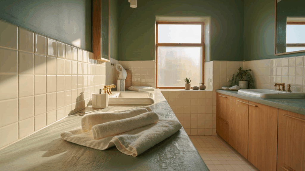
Soft, soothing hues set the tone for a calm bathroom, so start with a restrained palette of neutrals and gentle pastels that feel serene rather than sterile. You’ll lean into understated tones—warm creams, pale sage, dove gray—to foster quiet, reflective space. Use color to guide mood: softer blues invite relaxation; warmer taupes soothe tension. Balance saturations with ample white and natural textures to prevent heaviness. Consider lighting ambiance: choose bulbs that render these hues softly, avoiding harsh glare. Pair hues with practical choices—storage solutions that mirror calm: simple, clean lines, modular units, and discreet hardware. This clarity supports consistent, tranquil retreat experiences.
Neutral Base Tones
Neutral base tones form the quiet backbone of a calming bathroom, anchoring brighter accents with a steady, soothing field. You’ll choose warm whites, taupes, and soft grays to create a serene foundation, then layer subtle texture for depth. Keep surfaces matte or satin to minimize glare, allowing natural light to breathe. Introduce vintage accents sparingly—an aged mirror, porcelain knob, or enamel soap dish—to evoke timeless calm without competing with structure. Use bold contrasts only as deliberate punctuation: a charcoal floor or coal-black faucet against pale cabinetry. The result: cohesive, peaceful space that feels refined, organized, and effortlessly put together.
Accent Texture Pairings
Accent textures should elevate the calm without shouting. You pair textures to create deliberate textural contrast, guiding the eye without noise. Start with an accent wall in a soft, matte tone, then introduce complementary textures—smooth stone, woven fibers, and a sculpted ceramic—so each surface has a distinct voice yet remains unified. Remember balance: one dominant texture, two supporting ones. Let metallics stay subtle, never competing. In bathrooms, tactility matters as much as color. The goal is serenity through coherence, not drama. This approach makes the space feel curated, intentional, and breathable, inviting lingering, mindful moments.
Selecting Textures for Tactile Calm
Texture isn’t just about looks—it’s how you feel when you touch it. You’ll shape a calm bathroom by choosing textures that align with tactile sensations and texture contrast.
- Mix matte and satin finishes to heighten subtle contrast without glare.
- Layer natural fibers with smooth ceramics for inviting warmth.
- Prioritize plushabsorbent towels beside cool, hard surfaces for balanced tension.
This approach keeps surfaces distinct yet harmonious, inviting your senses to guide relaxation. When you vary scale and texture thoughtfully, you’ll notice calmer moments between steps, as your skin inhales the difference and your mind settles.
Balancing Patterns Subtly
Textures set the stage; now patterns weave the calm. You balance patterns by treating them as quiet conversations, not loud declarations. Start with a dominant element and introduce smaller echoes that repeat color and line. Aim for visual balance: distribute contrast and texture so one pattern doesn’t overpower another. Use pattern mixing sparingly—one bold motif, two supporting textures, thoughtfully scaled. Align motifs across surfaces: towels, tiles, and rugs can share a common rhythm without competing. Keep edges clean, spacing even, and shifts gentle. Subtle repetition creates coherence, preventing visual noise while preserving interest.
Choosing Natural Finishes and Materials
You’ll start with Natural材料 textures, letting raw warmth guide the room. Choose Earthy Color Palettes that echo wood, stone, and clay to foster a quiet, grounding vibe. Prioritize Sustainable Sourcing Choices so every material feels responsible as well as beautiful.
Natural材料 Textures
Natural材料 textures invite warmth with tactile honesty: think raw stone, warm timber, and woven fibers that age gracefully. You’ll feel how materials speak softly to the senses, guiding a calm, grounded bath.
- fiber weaves invite light, texture, and subtle pattern without glare.
- stone surfaces provide cool resilience and natural variation for quiet contrast.
- timber grains add warmth, longevity, and a tactile centerpoint that ages gracefully.
Choose tactile contrasts, not competing finishes; balance rough with smooth. Favor low-sheen, sealed stone and matte wood, so reflections stay gentle. Focus on honest textures over color noise to maintain serenity.
Earthy Color Palettes
Earthy color palettes build on the calm, tactile base of natural finishes, weaving stone, wood, and fiber tones into a cohesive mood. You’ll choose mineral inspired hues—soft ochres, sea-salted grays, and clay reds—that ground light, airy spaces. Introduce botanical motifs with subtle wall textures or printed accents to hint at nature without shouting. Keep contrast gentle: matte surfaces, satin tiles, and a touch of linen-like fabric. Favor warmth over brightness, and let texture guide perception: a limestone look, a weathered timber veneer, a woven basket. Consistency matters; unify elements with restrained accents for a serene, durable retreat.
Sustainable Sourcing Choices
When choosing finishes and materials, prioritize options that minimize environmental impact without sacrificing tactile appeal. You’ll notice how eco friendly materials feel and perform, from walls to fixtures, while supporting sustainable craftsmanship. Seek certifications and transparent sourcing to guarantee truth in claims.
- Look for responsibly harvested wood and low-emission finishes.
- Favor natural stone, recycled glass, and cork with durable, non-toxic seals.
- Support artisans who disclose mill practices and offer repairability.
This approach keeps your bathroom serene and grounded, blending texture with responsibility. Your choices create a calmer retreat and encourage eco conscious habits that endure beyond trends.
Layering Elements for Depth and Quiet
Layering elements creates depth without clutter, letting soft textures, muted tones, and strategic lighting play off one another to quiet the space. You’ll balance material contrasts—matte ceramic, linen, and glass—to guide the eye without shouting. Layering elements invites rhythm: a towel rack, a woven basket, a stone tray, and a plant near the sink become a quiet chorus rather than competing accents. Use repetition to unify: two textures, three tones, one glow. This approach creates visual depth that feels calm, grounded, and organized, helping you perceive space as serene rather than busy.
Testing Combinations Before Committing
Testing combinations before committing means you’ll sample finishes and textures in real light, at actual scale, so you’re not guessing later. Here’s how to proceed:
- color testing: lay swatches on walls, fixtures, and towels to compare warm vs cool tones under daytime and artificial light.
- texture samples: press sample boards or tile backs against cabinet fronts and flooring to feel cohesion and contrast.
- staged mood: place sample elements together in a temporary setup, evaluating ambience, depth, and balance before final choices. This prevents costly missteps and builds confidence.
Creating a Cohesive Spa-Like Vibe
To create a cohesive spa-like vibe, you’ll knit together color, texture, and proportion so the bathroom feels calm and unified. Begin with a restrained palette and repeat it across surfaces to reinforce harmony. Choose lighting fixtures that flatten shadows and provide even, ambient glow, ensuring mirrors and shelves feel integrated rather than separate add-ons. Pair soft textures with clean lines—think matte ceramic, wool, or linen towels against smooth stone. Plan storage solutions that conceal clutter while preserving open sightlines. Align hardware, accessories, and cabinetry for a seamless flow. Subtle contrasts, deliberate spacing, and consistent materials crystallize a serene, spa-inspired retreat.
Conclusion
In your retreat, you’ll feel calmer the moment you step in. You’re choosing colors that breathe softly, textures that invite touch, and patterns that whisper rather than shout. You’ll balance light and shade, layer natural finishes, and let quiet materials ground the space. Test combinations, trust restraint, and let cohesion emerge from thoughtful placement. When it all comes together, you’ll savor a cohesive spa-like vibe that soothes the mind and restores the body, room by serene room.
Leave a Reply